Article: Trends 2022: Party on or Cocooning?

Trends 2022: Party on or Cocooning?
The new year has started a little while ago, so it's time to do some cleaning up and a small update on our interior. What's hot and what's not this year?
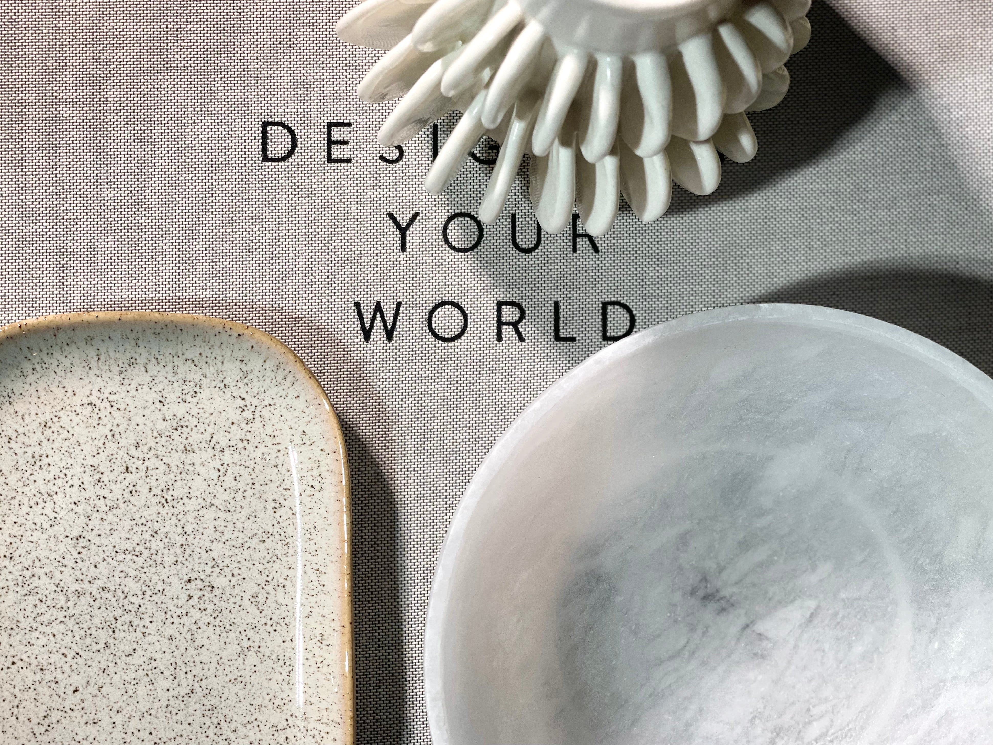
What we certainly take with us from last year, fortunately, is the need for handmade products. Let's get away from mass producing and buying. Everyone wants a unique piece in their home. Something that touches you, that has meaning for you. You often find that in handmade products. Each item is just a little bit different, different colour, structure, texture. A handmade piece is a work of art in your home. Let's get away from the perfect, symmetrical picture. Give it all a bit more life, a bit of soul. Look for vintage items in your basement, with family or swap pieces with friends.
 Nature continues to play a major role in the home: in colours, but also in forms. Organic forms, think of the beautiful tables in whimsical shapes that are encased in a layer of mortex. Nature is a source of inspiration, which we also draw on in our choice of colours and materials. Think of different shades of green, earth tones, ... In textures, we also see a lot of hemp, wool, linen, ...

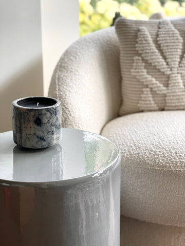
The pandemic has made us miss out on some cuddles and affection. This is reflected in the choice of fabrics. Soft fabrics are common, such as Teddy, which is often used to upholster armchairs and cushions. We yearn for cosiness, softness and cuddliness.

When it comes to cosiness and cocooning, we often look for harmony, calm and unity. We find this in our classics: off-white, beige, snow-white and of course matt black. The sand and earth tones also come into their own here. Tonal colours can help you create a very serene interior that can still be interesting through the choice of different materials and textures.

More than ever, we need to break free, to be positive. We also see this reflected in the interior design trends. Exciting colours, back to the nineties, flashy colours and patterns,... Bring the party into your home! Pantone chose 'very peri' as colour of the year, a lilac-purple shade. Serenity on the one hand but positivity and 'poppy' on the other. The colour almost embodies cheerfulness. But we also see cobalt blue, mustard yellow coming back often.

Finally, my rule always remains: do what you feel good about and let your personality shine through in your interior. Don't throw everything overboard, with some small interventions and moving things around or putting things away, you can quickly create a completely different atmosphere in a room.


Leave a comment
This site is protected by hCaptcha and the hCaptcha Privacy Policy and Terms of Service apply.